| PROJECT OVERVIEW |  |
| PUBLICATIONS | |
| PROTOTYPES | |
| EVALUATION | |
| PEOPLE | |
| EVENTS | |
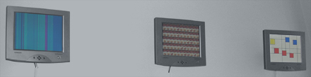
The first example using the Mondrian compositions as inspiration was this visualization, that shows information about e-mail traffic.

The visualization was designed to reflect the e-mail traffic of the memebers of the PLAY studio at the Interactive Institute. Each colored field represents the e-mail traffic for one person in the group. The size of the square growns and shrinks with the aggregate amount of e-mail that person has sent and received during the last few days. The color shows how "hot" a person is, that is how long it has been since she read or sent e-mail. Red indicates that a person is hot, i.e. that she was involved in e-mail activity during the last hour, whereas a yellow field indicates that it has passed some time since the last activity and blue means that the person is "cool" has not checked her e-mail during the last day.
The visualization is featured as one of the examples in the paper Informative Art: Using Amplified Artworks as Information Displays, presented at DARE 2000, in Elsinore, Denmark.
 |
Bus Composition |
|
Weather Composition |
|
Forecast Composition |
|
E-mail Composition |
|
Motion Painting |
|
Stone Garden |
|
Objective/Subjective Time |
|
Campbell Clock |
|
Activity Wallpaper |